...
- in which specific warehouse (equipped with the KNOT) the asset (equipped with the tag) is currently in and how much time it spent inside the specific warehouse;
- whether the asset (equipped with the tag) is on the road, traveling between warehouses, and how much time it spent inside the vehicle (equipped with the KNOT);
- (optional-additionallyoptionally) if TG-BT5-OUT tags are used, what was the temperature during all this time? You can also/instead monitor other parameters that you can get out of the advertised payload, like for example acceleration.
...
The end result would look like this:
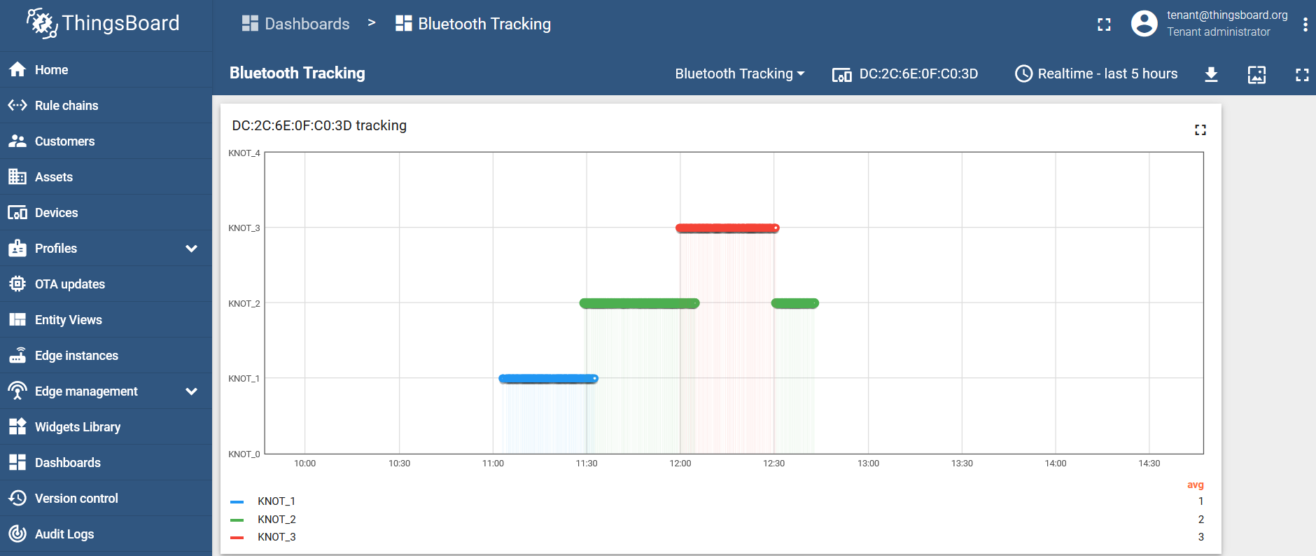
Per the dashboard, we can tell that:
- from ~11:00 to ~11:30, our asset was inside KNOT_1 Bluetooth range (inside warehouse #1);
- from ~11:30 to ~11:35, our asset was relocated to the vehicle (KNOT_2) that was parked near the warehouse (the tag was inside both KNOT's ranges);
- from ~11:35 to ~12:00, the tag was inside the truck (KNOT_2) - traveling to another warehouse;
- from ~12:00 to ~12:05, the asset was parked outside of warehouse #2, and it was inside both KNOT_2 and KNOT_3 ranges at the same time;
- from ~12:05 to 12:30, our asset was stored inside warehouse #2 (KNOT_3).;
- from ~12.:30 onwards, the tag was on the road again, inside the truck (KNOT_2).
Temperature visualization
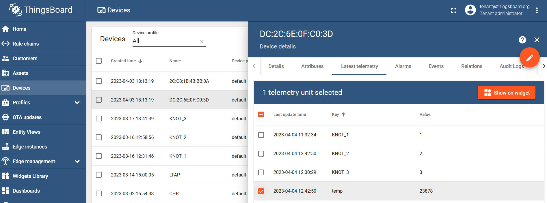
Select the tag's MAC address from the list of devices, go to the "Latest telemetry" section, checkbox "temp" parameter, and click on the "Show on widget" button:
Select a widget that you wish to use, for example under the "Charts" bundle, "Timeseries Line Chart". Click on "Add to dashboard", and choose the dashboard where you want to add the widget.
The result would look like this:
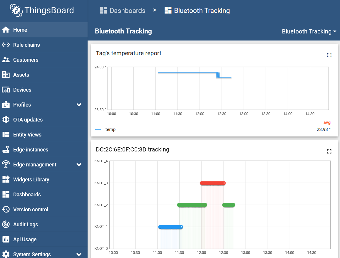
Now you will have an additional graph that will indicate how the tag's temperature changed during different time intervals.+ (optionally) temperature graph